Watercolour Paints
As anyone who has decided to take up watercolour painting has realised it is technically the most demanding and frustrating of all the painting mediums. Anyone who has sat looking down at that virgin white sheet of paper with a loaded brush knows exactly what I mean. As soon as that brush hits the surface of the paper you are committed, there is no turning back, you have no more than ten to twenty seconds to retreat. Drown the sheet of paper and I mean the whole sheet with plenty of clean water and you might, if you're quick be able to retrieve the situation. Let the paper dry and start again.....you were lucky!
There is no way that you can avoid that situation, apart from getting to know what you are dealing with, and that comes with practice, plenty of practice, paint every day if you can. I have been painting professionally for 35 years and I can truthfully say that I have painted every day apart from Sundays, and mostly with watercolours, I could never say that I have mastered the discipline but I have picked up a few tips over those years, and in this blog I hope I can share some of those tips and ideas with you.
In this first blog I shall deal with the thorny subject of pigment, a posh word for paint.
Artist quality or non-professional paints?
When it comes to watercolour paints you have two choices, artists quality, or non professional. There is not a great deal of difference between them apart from the cost, artist quality are more expensive. Technically the difference is in the ratio of binder to pigment, so as a result artist’s quality are certainly more intense, I personally use artist quality, but for the beginner there is not much wrong with the cheaper paints. Different paint producers have different names for these alternative lines, for example Daler Rowney refers to them as Georgian colours. whereas Windsor and Newton’s versions are called Cotman. All manufacturers supply paints in tubes and pans. In general tubes are more suitable for studio work whereas pans are perfect for field work. Most of my work is done using tubes, the paint in a tube is always semi moist whereas the pan colours harden up when not used.

Above is an image of my rather grubby box of field colours with a selection of half pans in-situ. Once the original colours have finished you can replenish them from your tubes. This box would fit easily into my trouser pocket and it has an useful waterbottle built in... Clever.
Stability of pigments
A far more important issue you should consider when selecting your paints is that not all colours are the same, Some colours, even artist quality are what can only be described as fugitive, meaning that they will fade if exposed to ultra violet, and any aspiring watercolour painters should be aware of this when choosing their colours. When shopping for paints you should ask the advice of the retailer, they will normally have an information sheet explaining the different feature of each colour. I have over the years built a very basic palette of colours which I know are stable,
If a retailer cannot supply you with the information (Google probably could) then look at the individual tubes or pans. Here you will find all the information you need.
What's on the label on a tube of paint?

However you can learn a great deal about the characteristics of the paint by reading the label on the tube or pan, for example if you look at the two tubes of artist quality watercolour paints above you will immediately notice the name and number, but the more important information lies beneath the name.
The Series letter corresponds to the price of the colour, A is the cheapest. The cost of a colour has no bearing whatsoever on its quality, it is more to do with the different ingredients that has gone into its manufacture. The cadmium colours, say red and yellow would be Series B whereas Cobalt Blue, a beautiful colour is Series C, and the most expensive.
Next to the series letter are a line of stars, these are the most important piece of information you will find on the tube. They denote how permanent the paint is, the more stars the longer lasting your colours will be. So in the example above Burnt Umber is more permanent than the blue, but having said that three stars is still a good indication of its permanence. Ultramarine Blue is one of my staple colours. Some fugitive colours only show 1 star and some none at all, you should steer well clear of these.
Opacity and Transparency
Beneath all these snippets of information are the self explanatory words Opaque and Transparent. These are also pretty important factors to consider when choosing paint. Watercolour is in essence a transparent medium, its main characteristic is its translucency and each wash should allow the underlying colour to show through, this can be used to great effect if for example you want to make a green. Allow the initial yellow wash to dry completely then apply a blue wash (a thin film of weak paint which allows the paper underneath to show through) over it, hence you have green. If both colours are labelled as transparent then you are more likely to achieve the desired effect.

I personally use both opaque and transparent colours, as long as you are aware of each colour’s attributes then you can avoid the scenario of applying an opaque colour over another colour.
Choosing the right palette
Building up a palette that suit you is a slow process of hit and miss, over the years I have made some embarrassing mistakes buying colours which look beautiful but have faded away to nothing in a very short time.
Watercolours have other characteristics that you have to discover for yourself, for example, granulating. Watercolours are made up of fine particles bound in a binder (usually gum Arabic) some of these particles are heavier than others and when painted out in a wash of colour the pigment settles in the hollows of your paper. Ultramarine Blue is what is known as a granulating pigment. The above photo has some indication of granulating, the yellow has finer particles than the blue and has washed out quite smoothly, whereas the Prussian Blue with its heavier particles shows some degree of granulation.
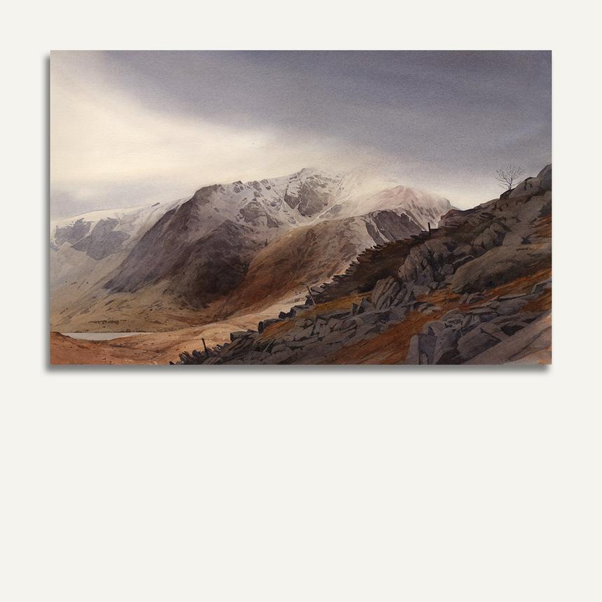
My advice to anyone embarking on the watercolour journey is to keep your palette simple. By all means experiment but too much experimentation can lead to frustration so limit your palette to no more than 6 colours. I can truthfully admit to being able to paint a successful mountain watercolour using two colours... Burnt Sienna (the most versatile pigment on the planet, and the most stable) and Ultramarine Blue. The painting below of Y Garn with a Stone Wall, for example, was completed using just these two colours. Use these two colours also to produce a more vibrant black.


